The genre of my magazine is Fashion. The Codes and conventions that are typical to see of this genre are; Trends, outfit inspiration, beauty, brands, tag line, The primary audience for my magazine is 18-25, targeting a higher end group of women. The aim is to give readers a chance to gain personal identity and gather information about the genre of fashion that the reader has a certain passion for.
Genre
The genre I decided to explore is Fashion. I feel this is a versatile genre that can appeal to lots of people despite what their gender, age, ethnicity, sexuality or occupation is. Whilst exploring current fashion magazines, I have become familiar with conventional images and layouts of magazines that majority of the time I find are less interesting to look at. Therefore, with the knowledge I am building around the genre I want to experiment with abstract and unusual photos for my magazine that will intrigue readers.
Target Audience
The target audience for my fashion magazine will predominantly be women aged 18-25 years old. Their social status will be ABC1 aspirers that fit into either upper middle class, middle class or lower middle class. This means they have an education and majority of the audience have managerial occupations with an average salary or above.
The psychographics: The typical target audience would be an artsy female who regularly attend gigs, socialising will friends and enjoys the medium of art/ photography. They have an interest in fashion and to an extent take pride in their appearance. They are affluent and passionately engaged readers with a sense of loyalty to the magazine.
70% of readership are women
30% of readership are male
Similar magazines
A few of these covers relate to my magazine ideas as some create a subtle unsettling feeling for the reader, especially Dazed and diesel, the way the nature is intertwining forms an abstract mood which is what I am drawn to. The artwork is detailed and realistic which is another aspect I aspire to achieve in my final product.
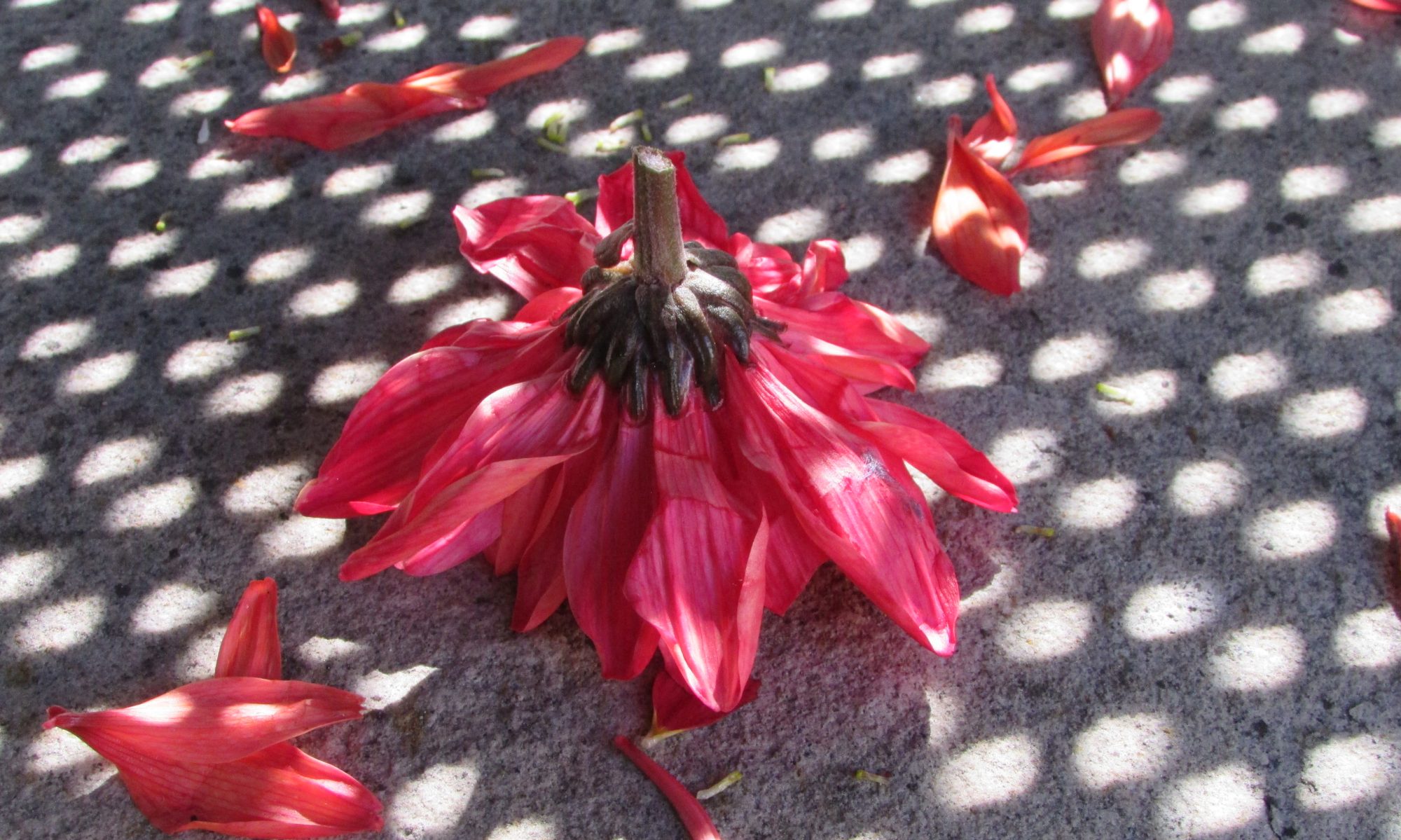
I love the idea of featuring nature at times in my magazine as the use of a specific prop can be beneficial for the outcome of the photograph as it becomes a more unusual yet creative composition; rather than a conventional magazine cover.
These magazines will acts as my competition when creating my magazine due to their innovative photography and editing. I strive to overcome this by combining inspiration from them all and the use of other images to form a unique magazine.
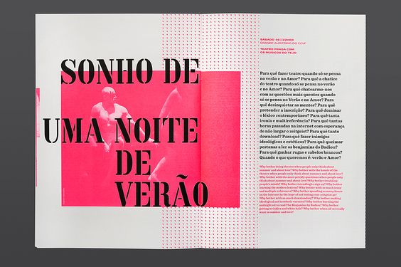
Layout inspiration of double page spread
A column on the edge on the edge of the page going down in blue w (azure) with an image behind it.
Title could be a subtle fade of blue over a double page spread with writing and image behind.
Collage of images & text combined/ overlapping looks trendy and aesthetically pleasing.
Paragraph covering some of the image, interesting and enticing- Using my colour palette.

Text over some of the image, not as much as here (quote/models name?)-eye catching, intriguing. This layout is unique and not typical to see in regular magazines.
